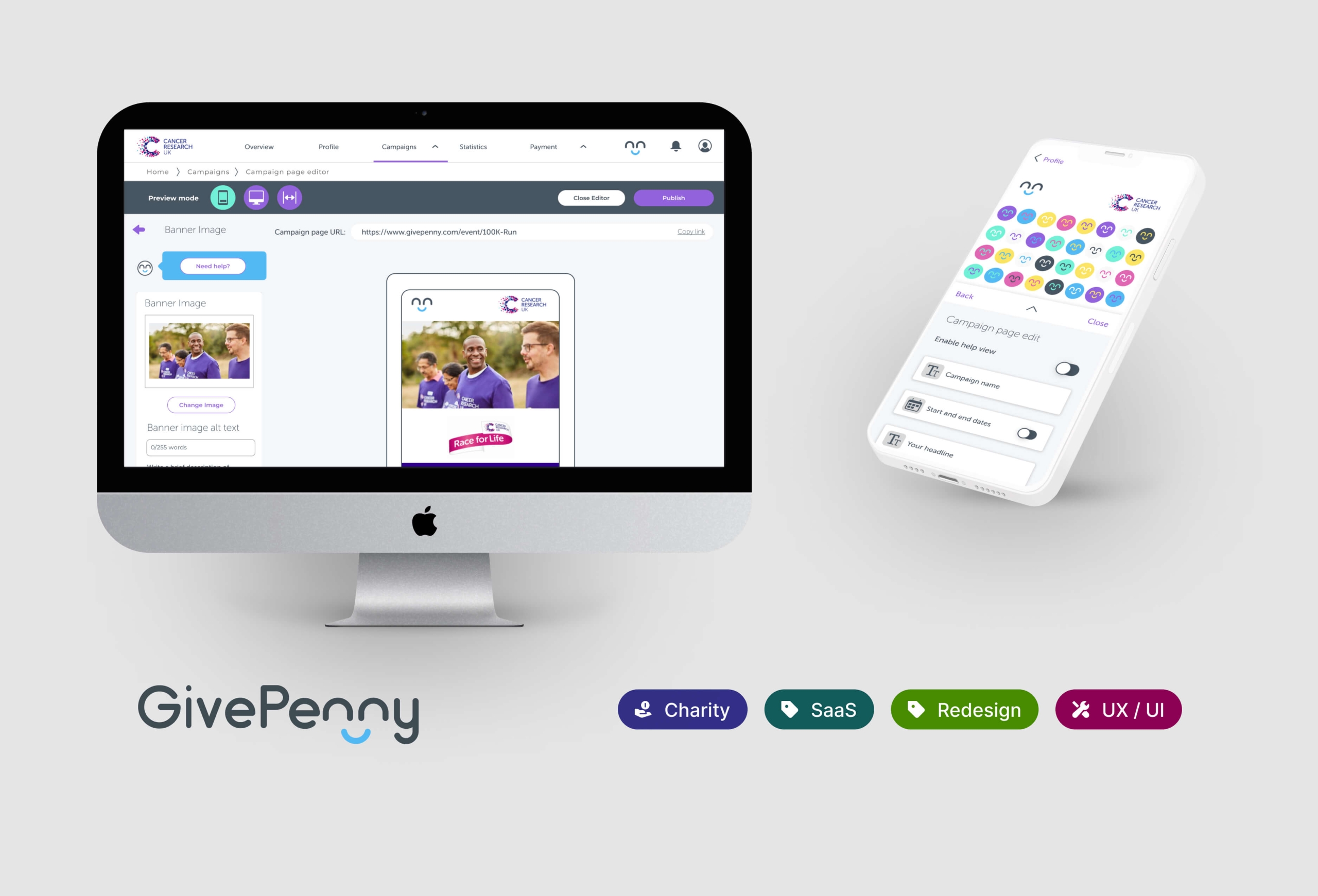
GivePenny WYSIWYG
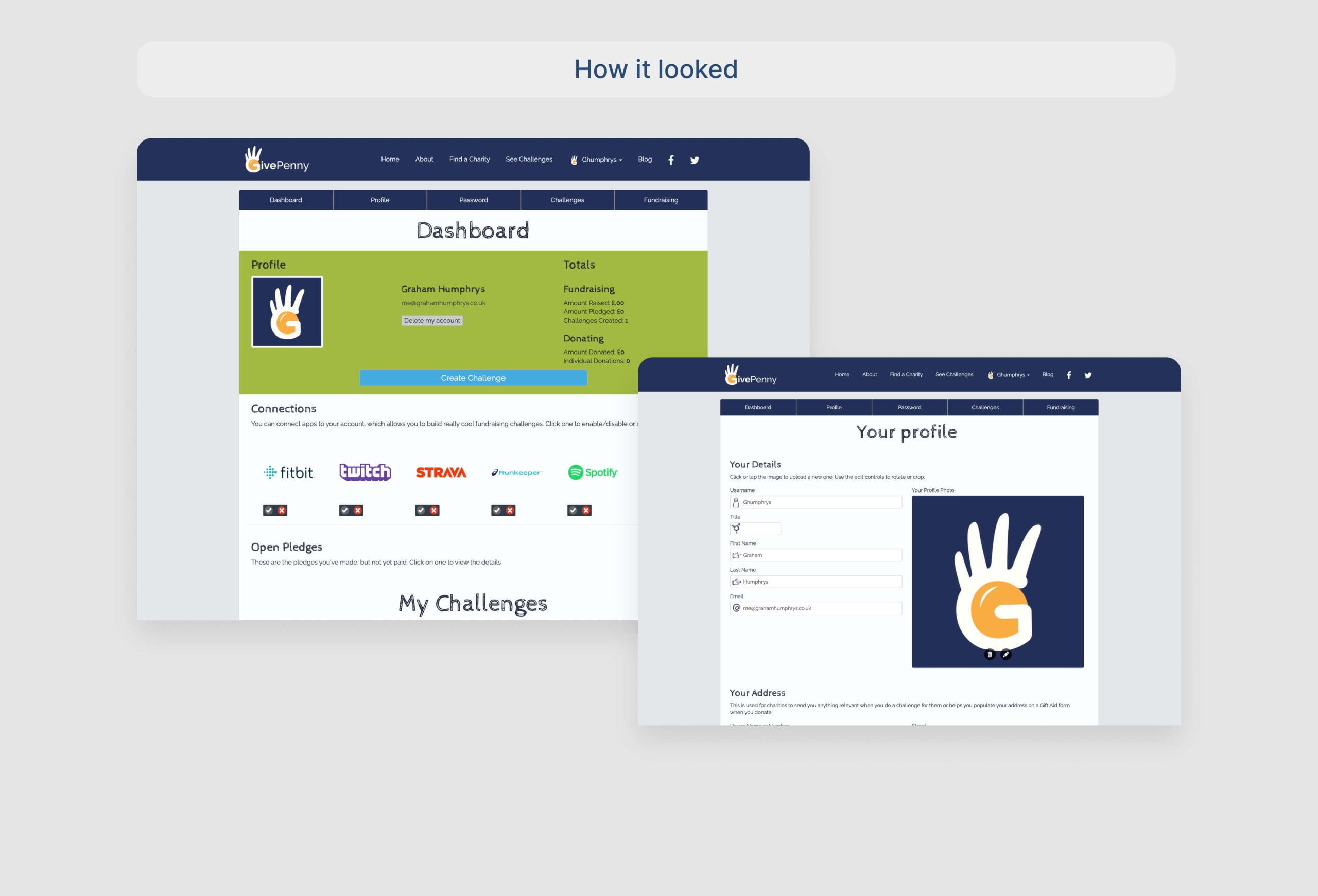
GivePenny, a fundraising platform integrating fitness apps and Spotify, faced high user acquisition but low retention. As a UX designer, I tackled the challenge by:
Researching: Understanding user needs through charity sector research and user feedback.
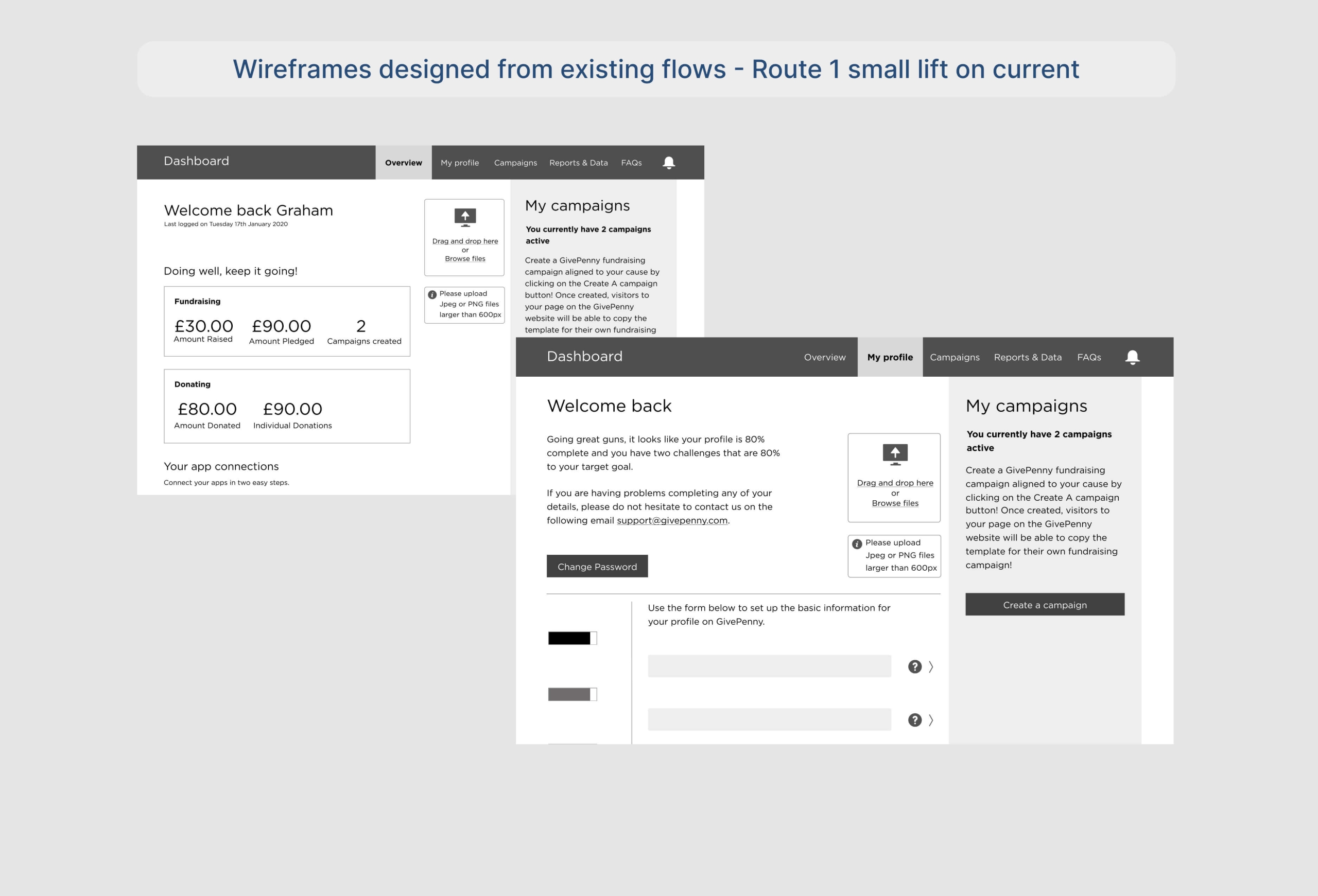
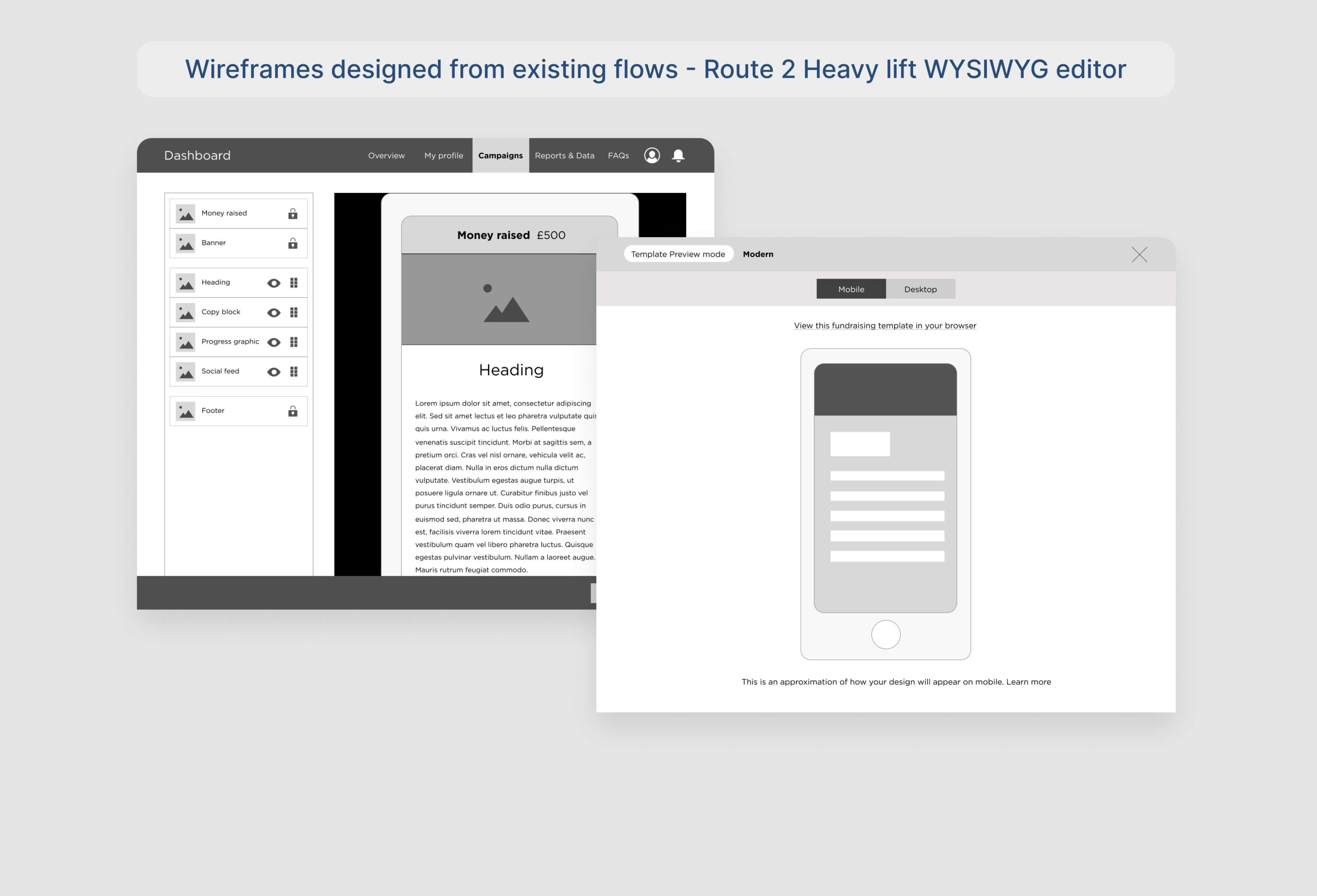
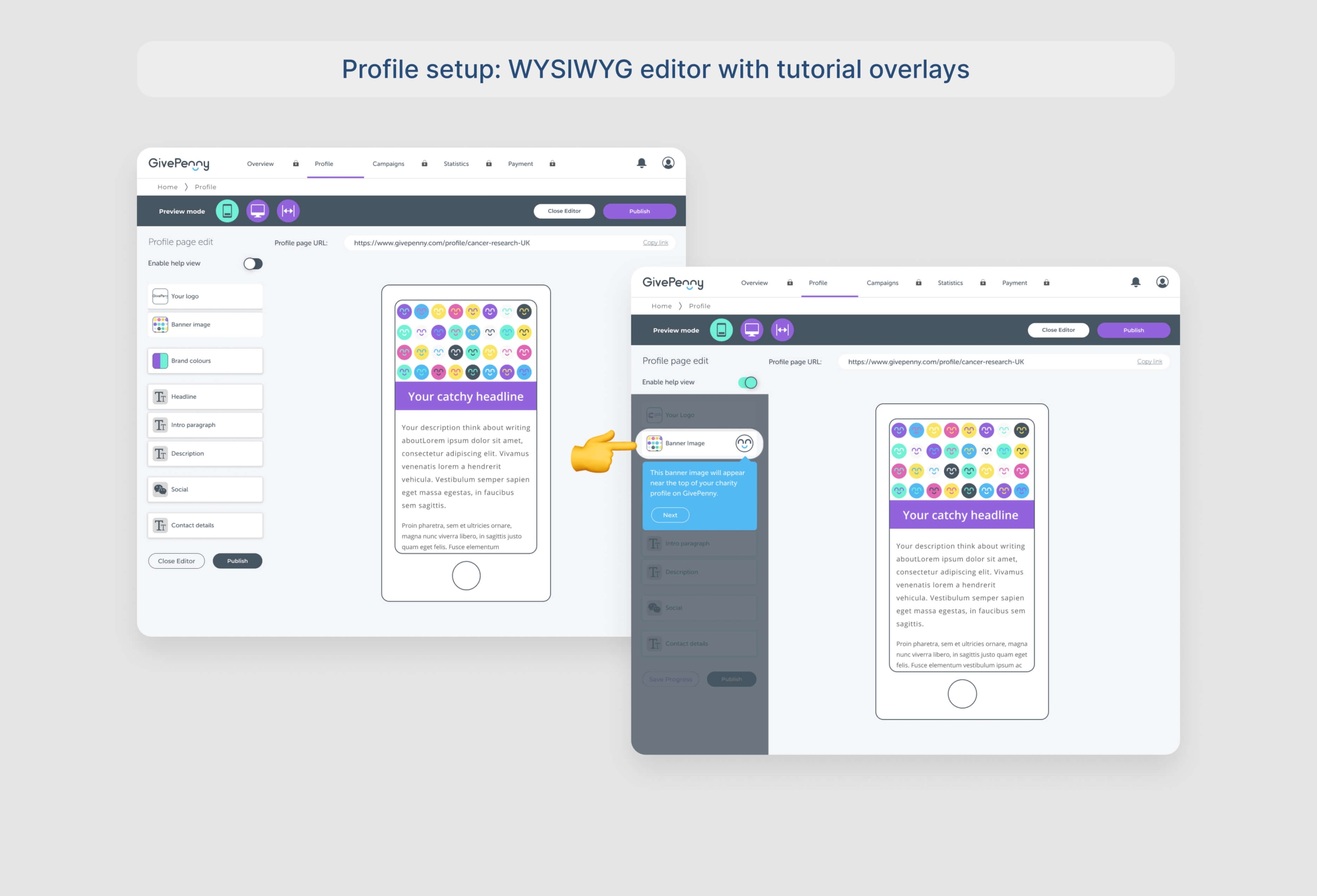
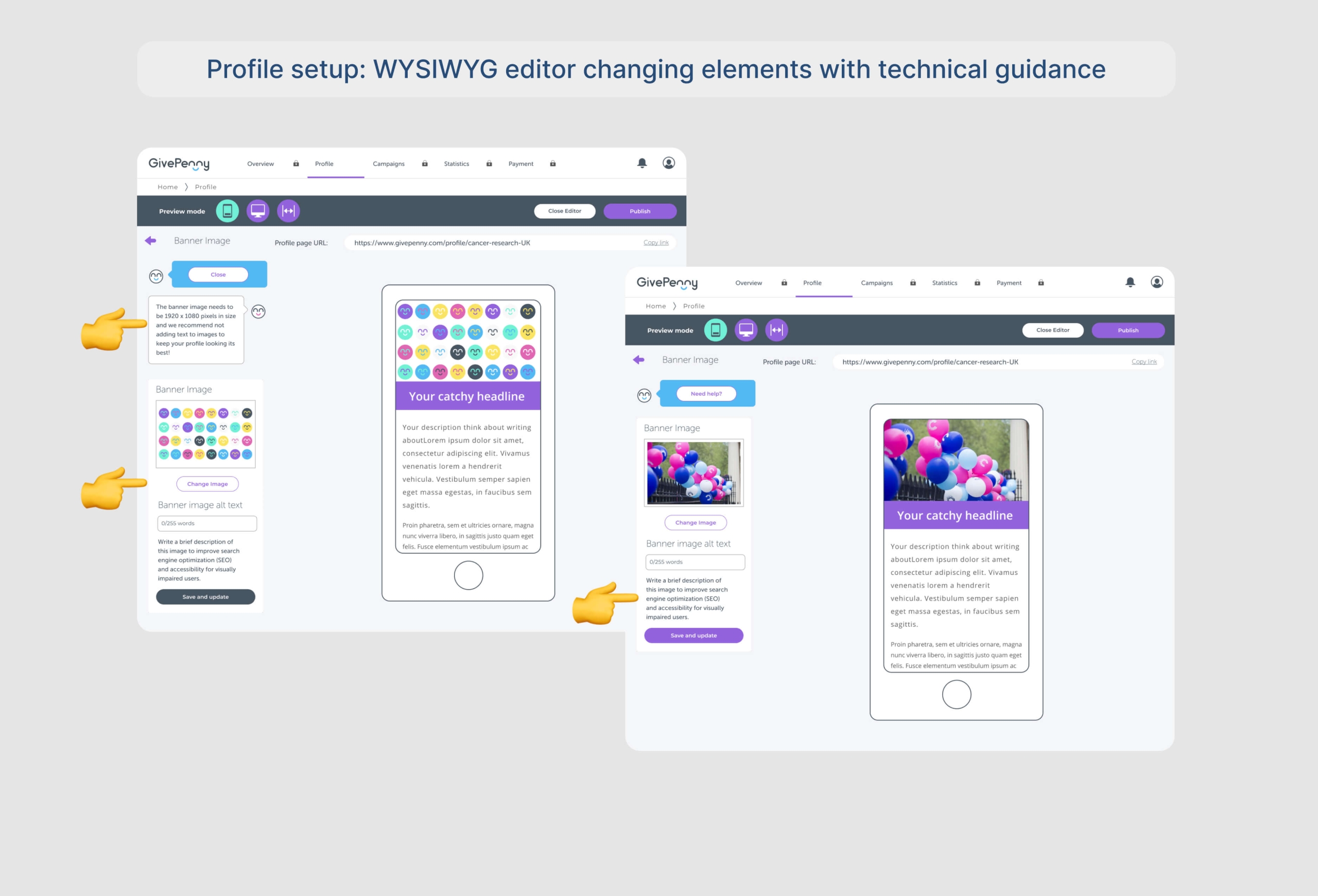
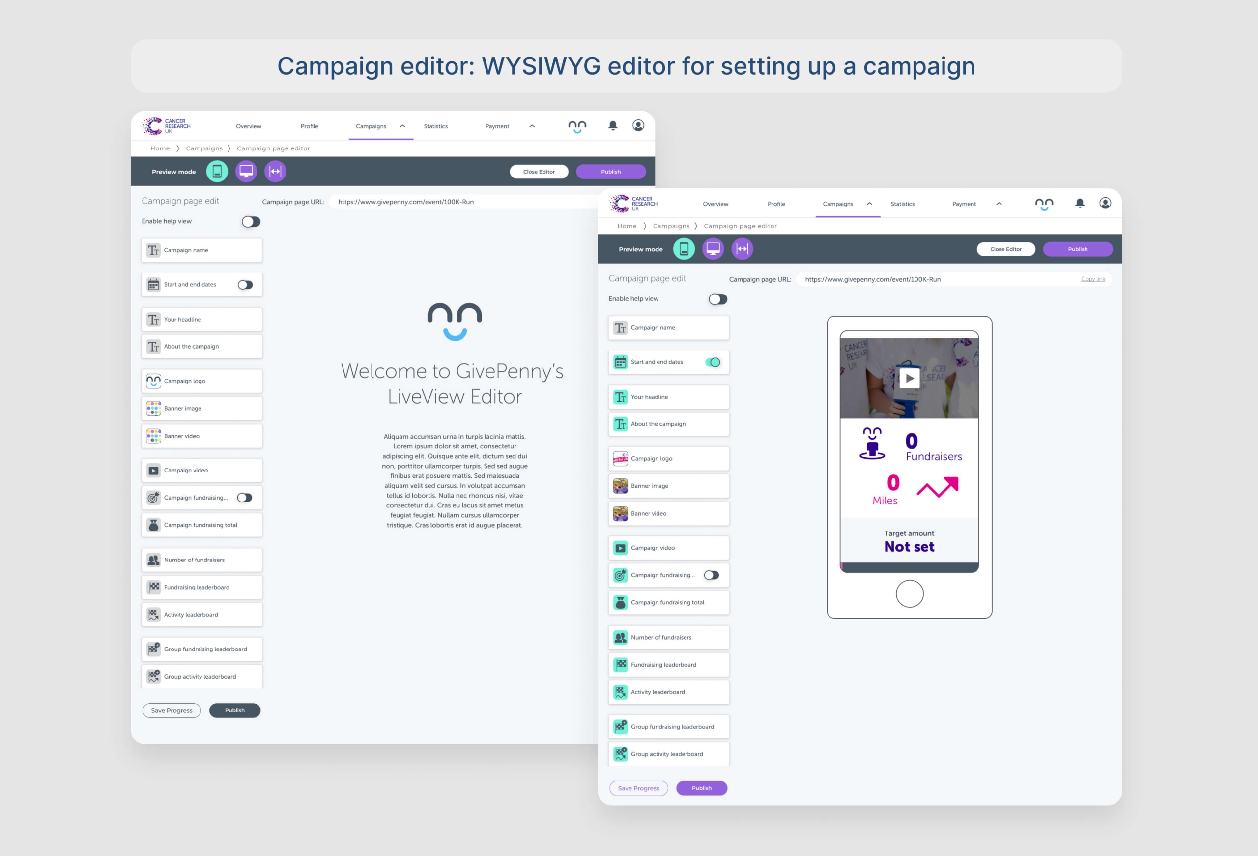
Prototyping: Exploring two approaches – a form-based and a WYSIWYG editor inspired by Shopify.
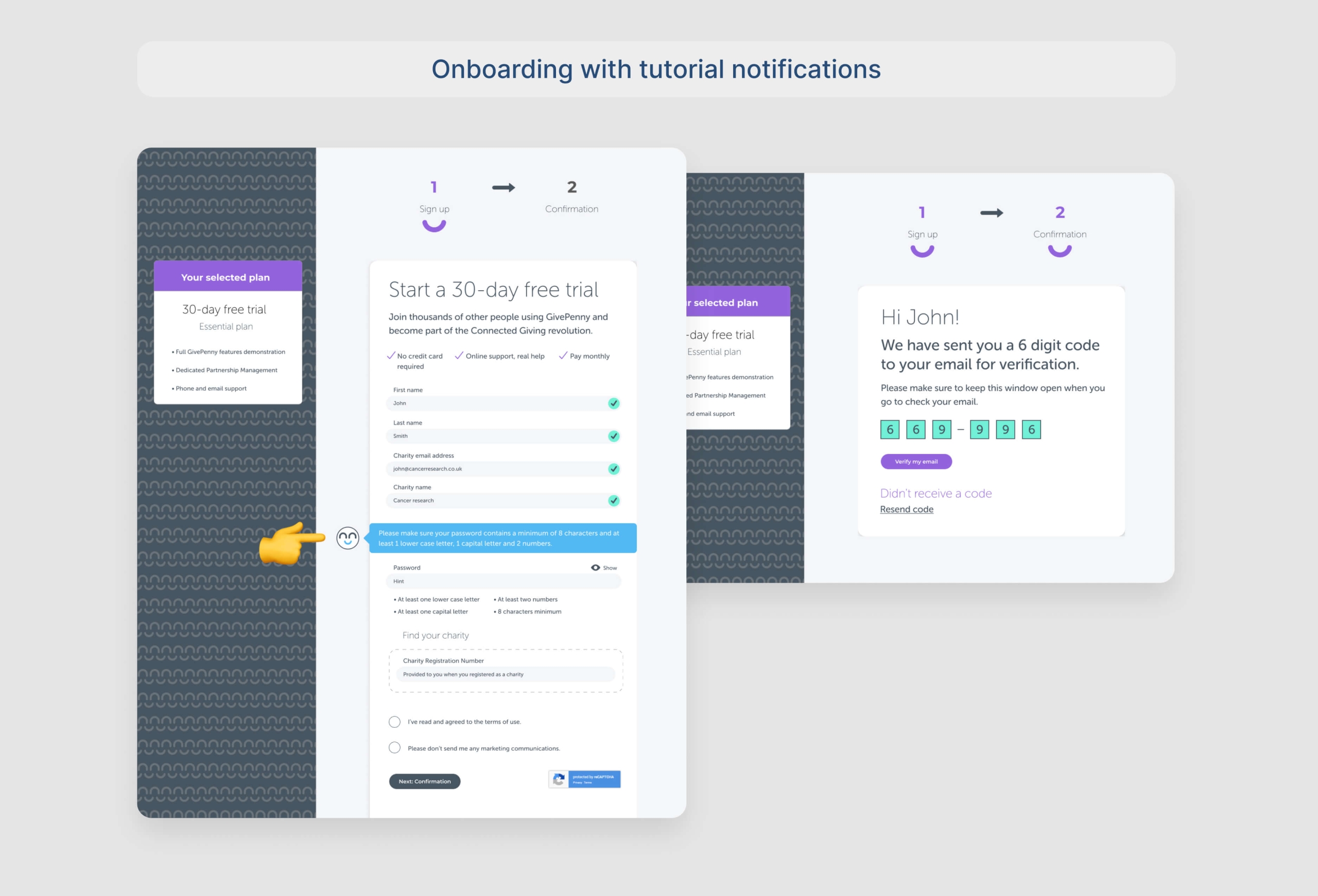
Adding Help Mode: Integrating a brand mascot-guided tutorial to assist users.
Constraints: Aligning with a separate marketing agency’s visual redesign and a tight three-month timeframe.
Results: Implementing the WYSIWYG editor led to a 30% increase in user acquisition and a 60% reduction in support tickets, likely due to the improved user experience and helpful tutorials.
Lessons Learned:
User-centered design, even with limited testing, can significantly improve platform success. This project lays the foundation for future GivePenny development.
- Client GivePenny
- Year 2017
- Services Product Design Conceptual Design


