Three and Google Assistant
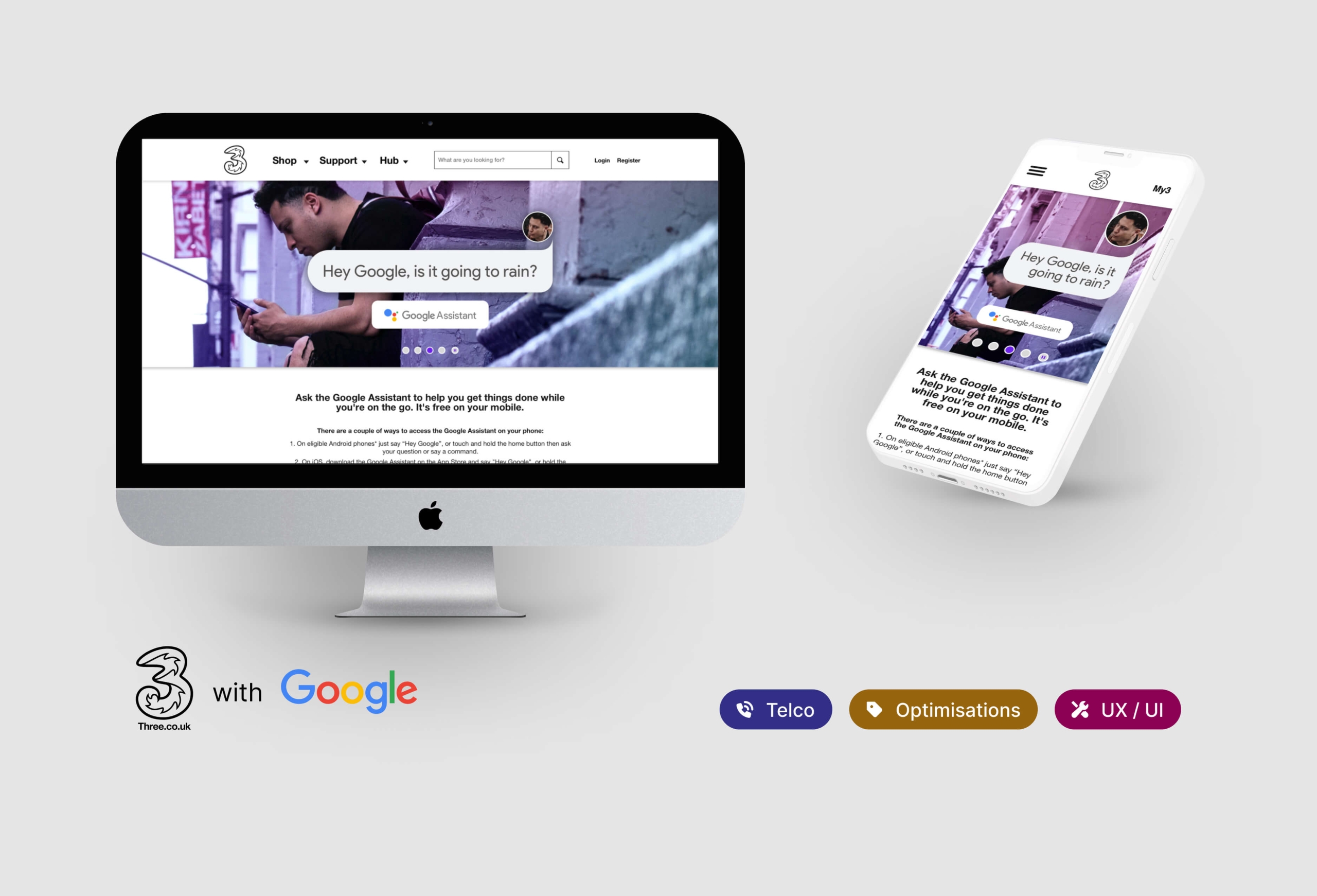
In 2019, amid multiple site upgrades at Three, I led the Google Assistant proposition from concept to delivery. This involved the online journey, extending to retail and AV channels—all achieved within a two-week sprint.
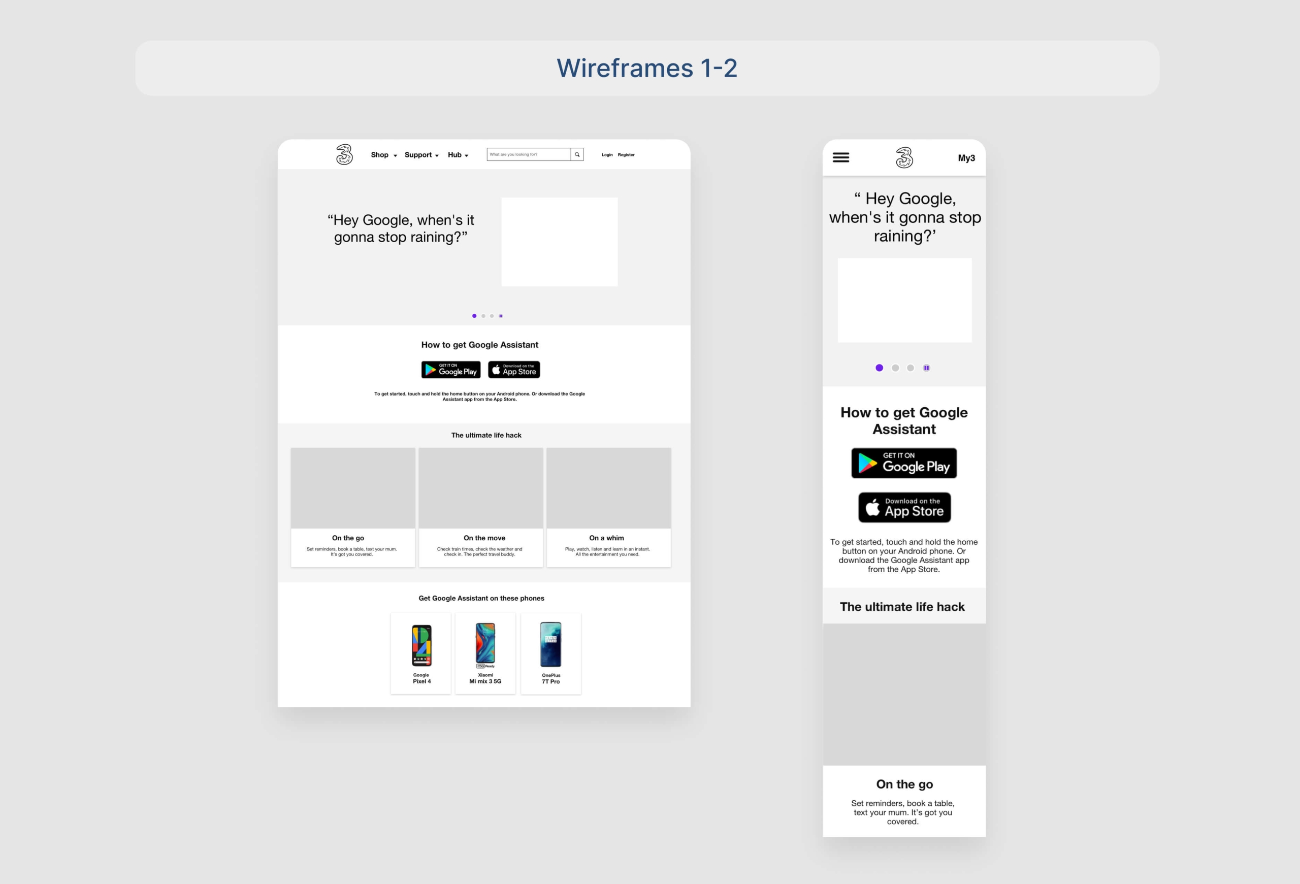
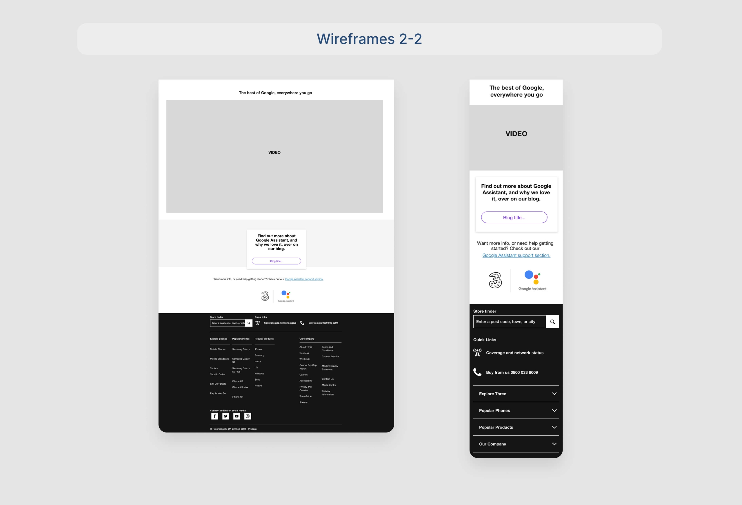
Wireframes: Due to the project’s initial vagueness, the UX laydown was the visual tool sent to Google for hierarchy and copy approval, ensuring alignment before Visual Design.
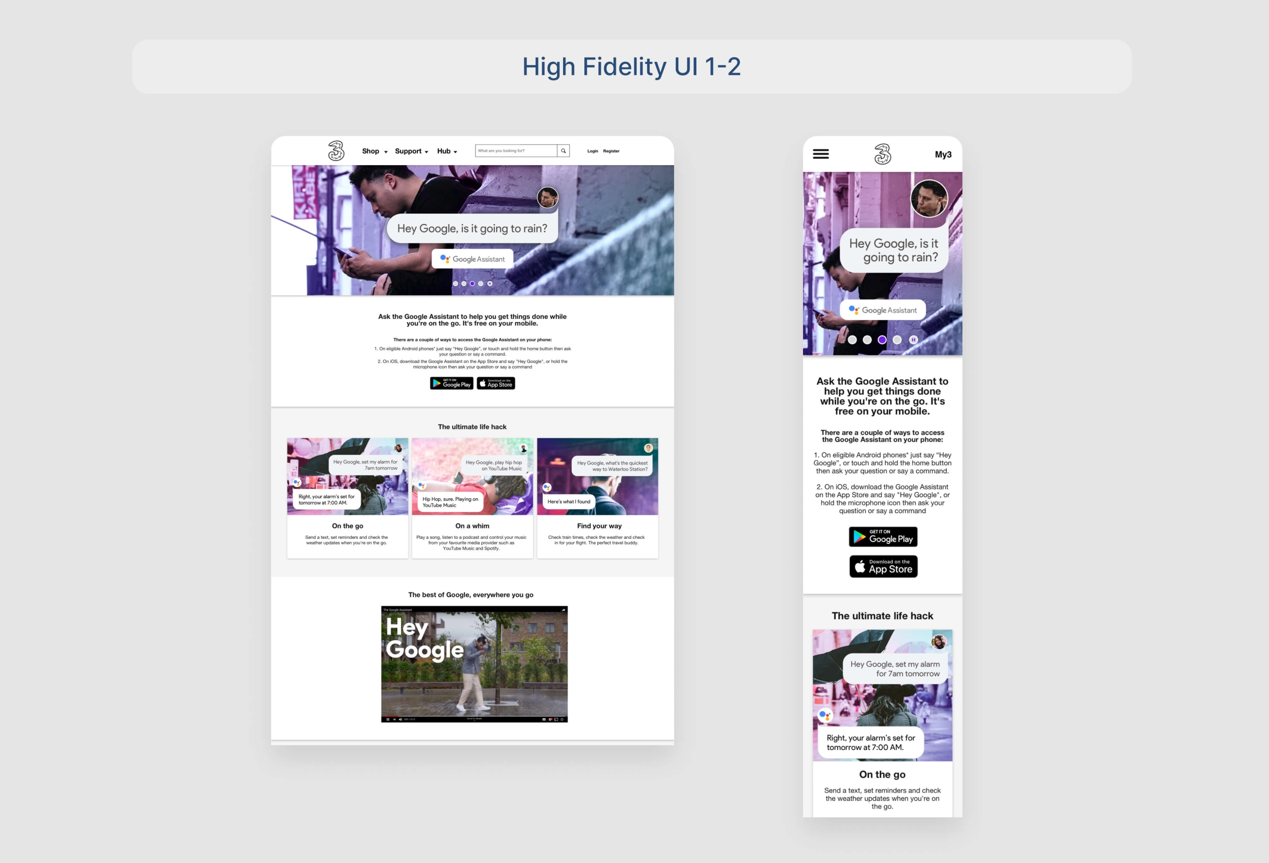
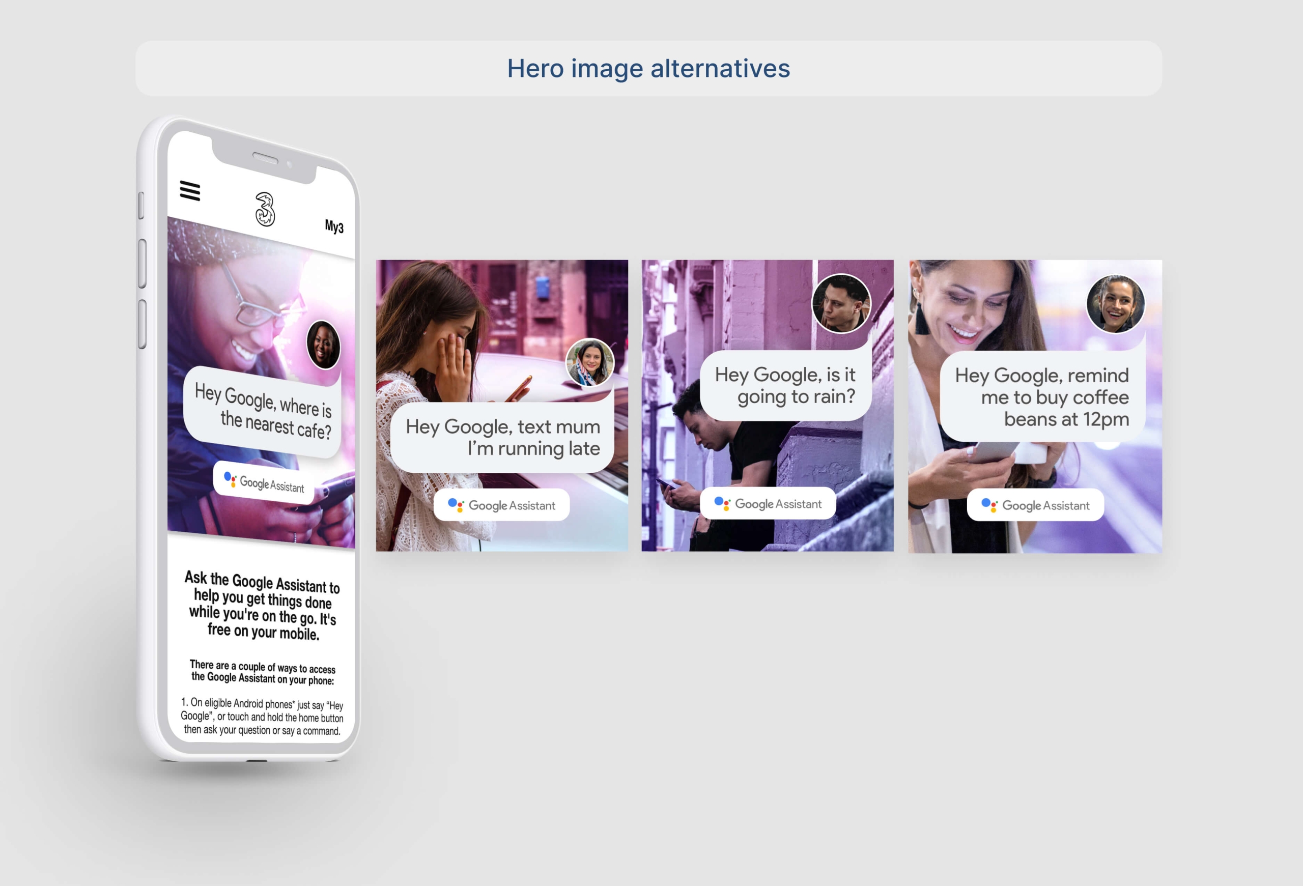
Header Carousel Imagery: Seamlessly blending Three and Google Assistant brands was crucial. The hero image featured a human in an avatar space, signifying the user sending queries to Google Assistant, encapsulated in a distinctive bubble asset.
Floating Cards: The floating card module added substance to the voice assistant, illustrating three real-life scenarios showcasing the product’s utility.
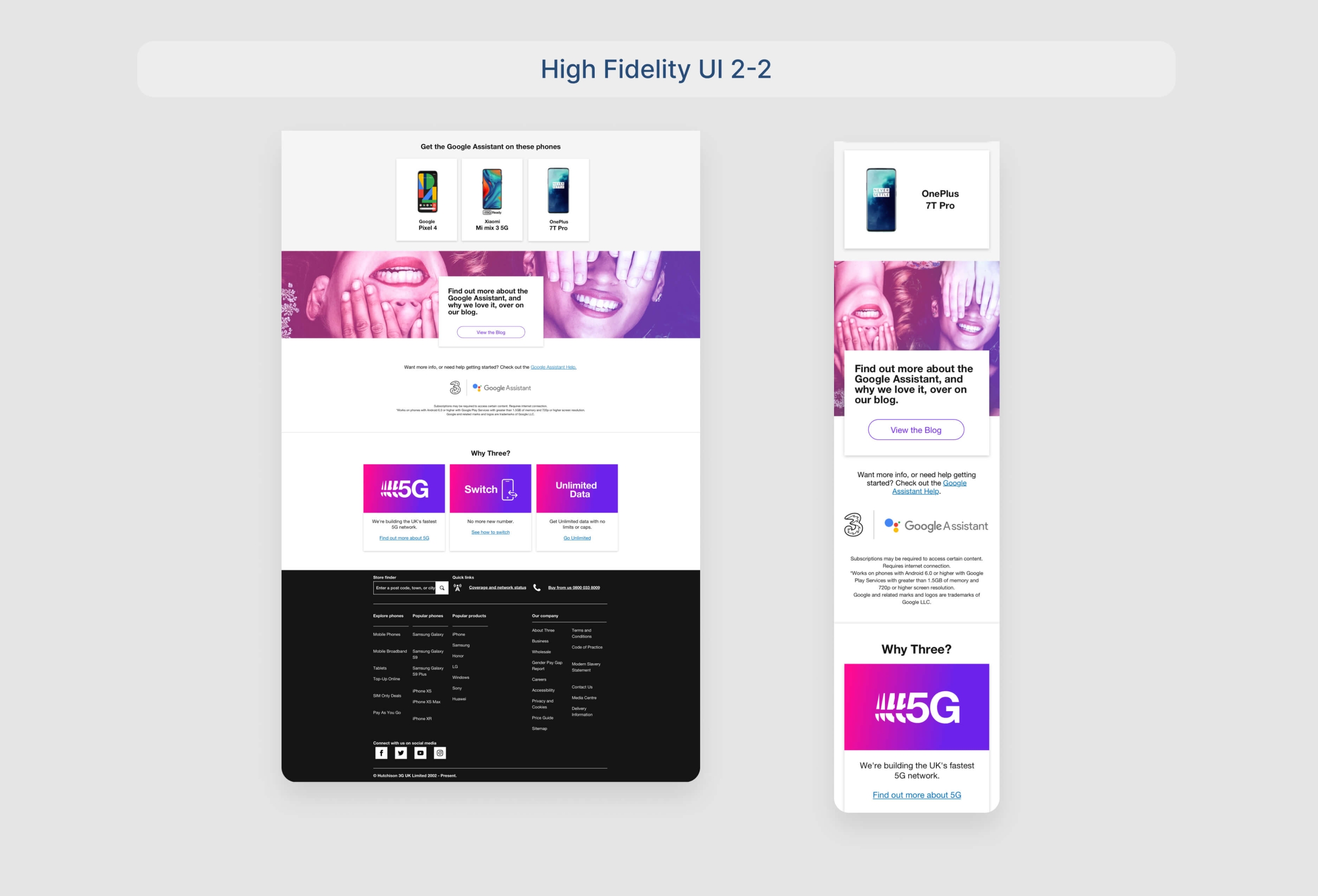
Final Design: After numerous sign-offs, the project culminated in the final design. Harmonizing two major brands posed challenges, with feedback from Google San Francisco, London, and Three HQ—a delicate yet crucial balancing act.
Conclusion
This case study delves into the intricacies of merging Three and Google Assistant brands seamlessly, emphasizing the challenges faced and strategic decisions made throughout the UX journey.
- Client Three (Telco)
- Year 2019
- Services UI/UX


