A simpler campaign editor

“Graham brought clarity at a point where we needed to move fast but make the right calls. He helped us identify why users were dropping off, challenged assumptions, and designed a solution that significantly improved activation and reduced support demand. He added value well beyond execution and was a trusted partner during an important phase of the product.”
Project summary
I worked with the team on how fundraisers create campaigns, turning user needs and constraints into a simpler guided setup.
Despite strong acquisition, many users dropped off during campaign setup because the flow was hard to understand and needed too much support.
The challenge was improving activation and self-service within a three-month delivery window, while aligning with a separate agency-led visual redesign already in progress.
A guided WYSIWYG editor reduced friction during campaign creation, contributing to a 30% increase in acquisition and a 60% reduction in support tickets.
My role
I partnered with the GivePenny team on a critical early product decision: how fundraisers create and manage campaigns without needing support at every step.
My role focused on identifying why users dropped off after sign-up and turning those findings into a more guided campaign-creation flow within tight delivery constraints.
Problem
GivePenny was acquiring users, but many fundraisers failed to progress beyond initial setup. Campaign creation felt hard to follow, leading to low retention and a high volume of support requests.
This friction at a key activation moment limited the platform’s ability to convert initial interest into sustained usage.
Designing a self-serve fundraising platform for charities
Challenges
The core challenge was making campaign setup easier without slowing delivery or disrupting parallel workstreams.
This required:
- Designing a simpler, more guided creation experience that reduced cognitive load for non-technical users.
- Working within a three-month timeframe while aligning with a separate agency-led visual redesign already in progress.
The product still needed to reduce support demand while leaving room for future features.
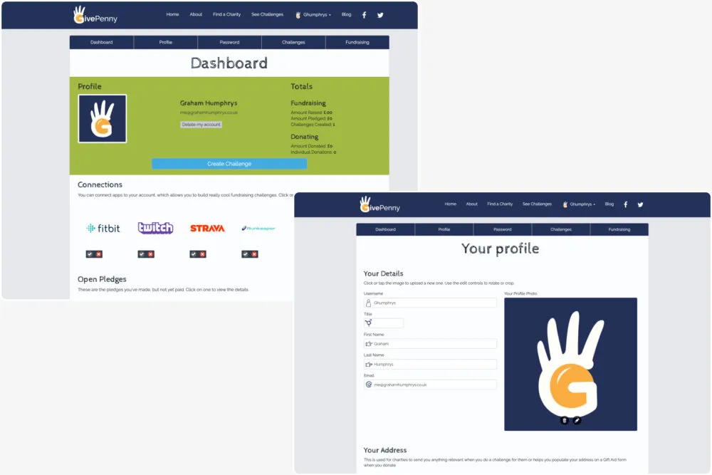
Manual fundraising workflows limiting speed and scale
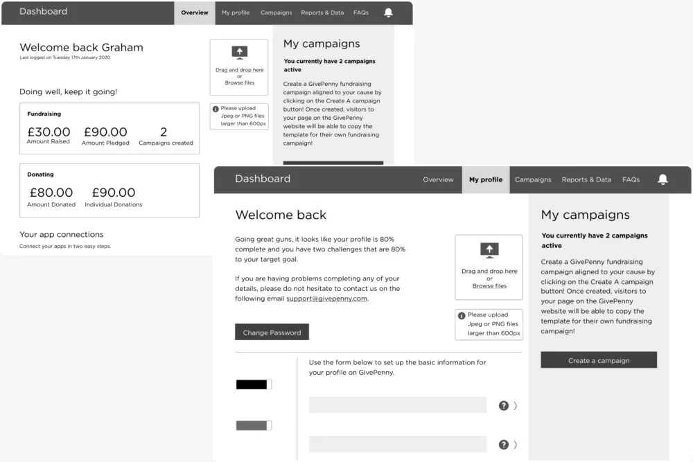
Enabling non-technical users to launch campaigns independently

Outcome
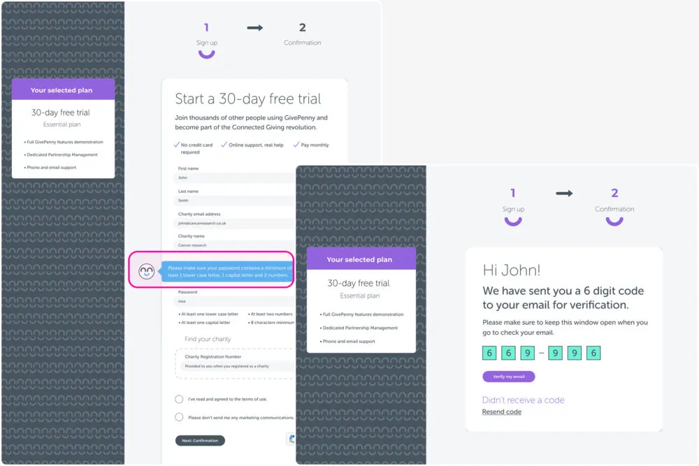
Two approaches were explored: a traditional form-based flow and a WYSIWYG editor inspired by familiar tools such as Shopify. The WYSIWYG approach was selected and enhanced with a guided “Help Mode” using a brand mascot to support first-time users.
This improved confidence during campaign setup, contributing to:
- A 30% increase in user acquisition
- A 60% reduction in support tickets, indicating clearer self-service behaviour
- Higher-quality sign-ups from charities with clearer intent
- Stronger positioning for growth and partnerships
The work gave GivePenny a self-serve campaign flow that charities could use with far less hand-holding.
A self-serve platform for charities
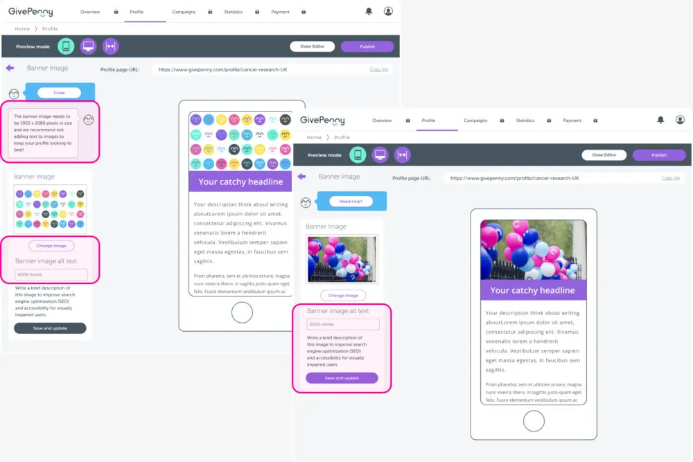
Onboarding experience
Reusable components supporting rapid campaign creation

A SaaS platform ready for live campaign work