Reducing design system sprawl at WTW
“Graham played a key role in bringing structure and consistency to a complex SaaS platform. He approached the design system with clarity and rigour, carefully balancing flexibility with maintainability. His attention to detail, system thinking, and ability to collaborate across design and engineering made the system practical to use and easy to scale. The work laid a strong foundation for future product development.”
Project summary
I designed and delivered a comprehensive Figma design system for WTW’s insurance SaaS platform.
UI inconsistency across products slowed development and left the platform feeling fragmented.
Managing typography sprawl, complex component variants, and Light/Dark mode behaviour across a large product surface.
More than 80 type sizes and 30+ button variants were consolidated into a documented Figma system for the insurance SaaS platform.
My role
I was the UX/UI designer responsible for designing and delivering a Figma-based design system for WTW’s insurance SaaS platform. My role covered system architecture, component design, variant strategy and documentation across desktop, tablet and mobile.
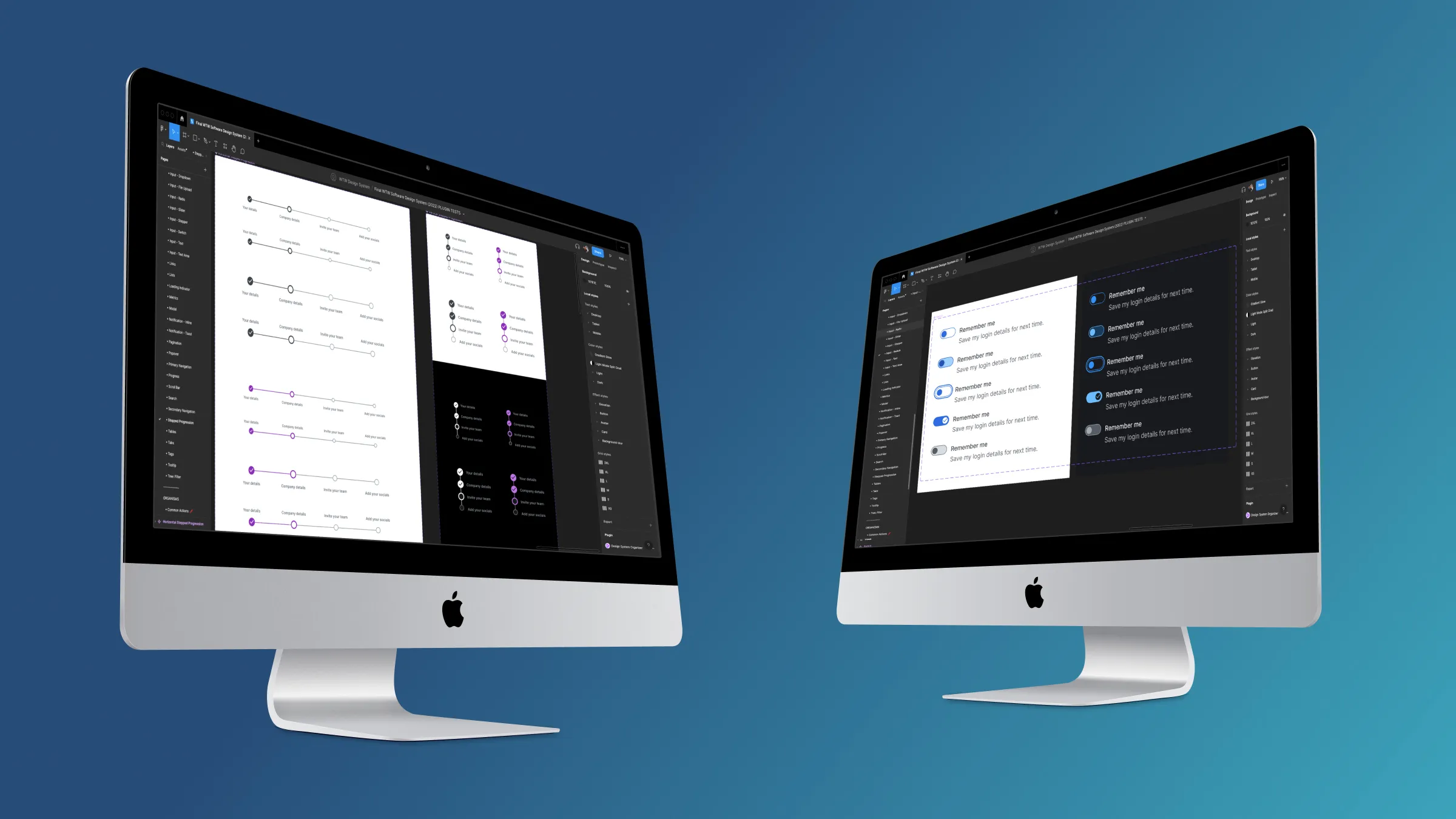
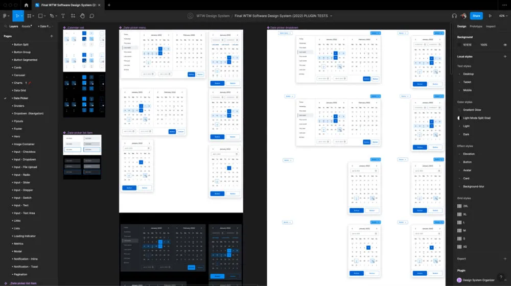
Comprehensive Figma component library for the WTW design system
Problem
WTW’s SaaS platform had grown organically over time, leaving a lot of UI inconsistency across screens and products. That slowed design and development, and made new features harder to add cleanly.
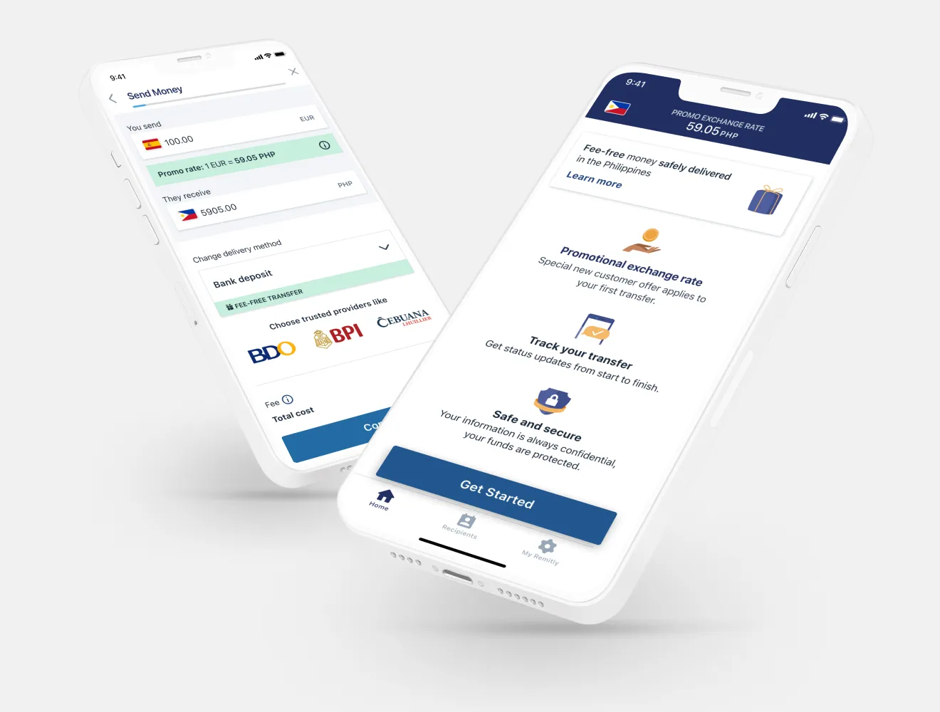
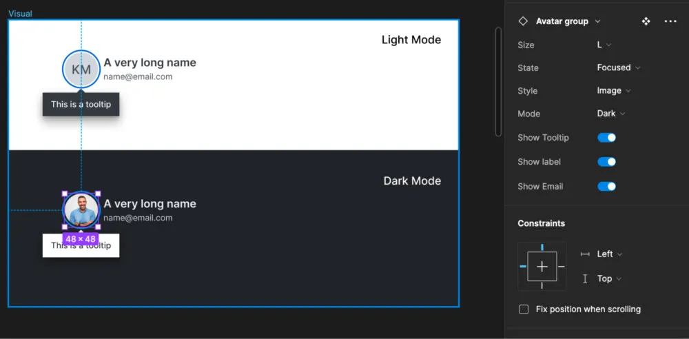
Inconsistent cross-theme UI patterns before system standardisation
Challenges
The system needed to support a large product surface while still being usable day to day:
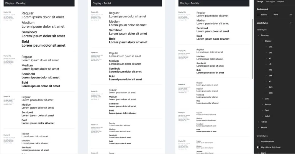
- Typography sprawl: More than 80 type sizes existed across platforms and needed to become a reusable scale.
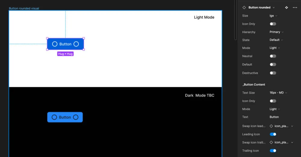
- Component sprawl: Core components such as buttons had more than 30 variants, plus another 20 nested states. Boolean and conditional variants helped reduce the mess without removing useful flexibility.
- Light and Dark mode: Components needed to work across both modes while preserving spacing, padding and label hierarchy.
Key decision
The important decision was to stop adding variants for every product request. Type and component rules were rebuilt around reusable token-led patterns, which made the system easier for design and engineering to maintain.
Managing high-variant components with token-driven controls
Outcome
The final design system consolidated the worst of the type and component sprawl into a shared Figma library with practical documentation.
It enabled:
- Faster iteration and safer UI changes
- Reduced duplication across design and development
- A shared language between product, design, and engineering
The system gave teams a cleaner way to extend the product without creating another round of duplicate UI.
Typography system applied consistently across product UI